
Atlanta Family Therapy is a private practice run by a single therapist. Dan, the owner, wanted to refresh a website he had managed independently for several years and get professional guidance on how to better attract new clients—specifically by making it easier for prospective clients to understand his services, assess fit, and confidently reach out.
I led this engagement end‑to‑end, owning research, information architecture, content strategy, design, and implementation.
The core challenge wasn’t visual polish—it was reducing uncertainty in a high‑trust, high‑stakes decision. Prospective therapy clients often arrive anxious, unsure of what they need, and hesitant to reach out unless they feel confident the provider is a good fit.
The research goal was to understand:
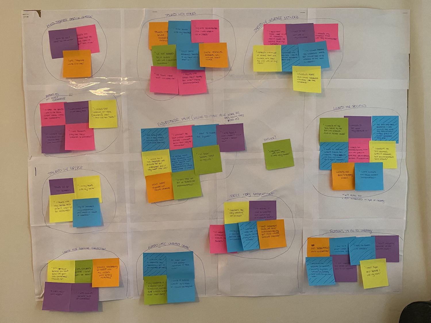
I conducted surveys and interviews with people who had previously searched for or considered therapy services, focusing on how they evaluated providers and what information influenced their decision to make contact.
A clear decision sequence emerged:
This challenged my initial assumption that credentials and qualifications would be the primary trust signal. Instead, participants prioritized service fit and clarity early, with credentials becoming more important later in the decision process.
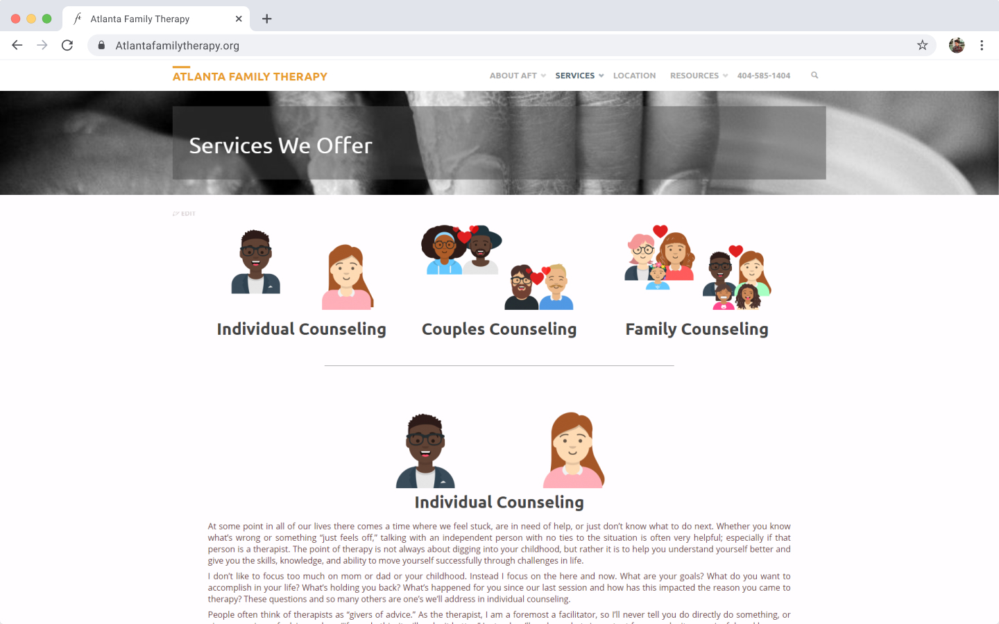
Research also revealed structural issues with the existing site:

I anchored design decisions around a single principle:
Structure the site around how clients decide—then remove anything that slows that decision down.
Navigation was treated as a prioritization tool, not a sitemap, and content was designed to support conversion and trust rather than completeness.
I restructured the top‑level navigation to reflect the user decision sequence:
Before
After
Several pages were consolidated to reduce redundancy and eliminate ambiguity. Combining bio, credentials, and practice information clarified that the practice consisted of a single provider, while still allowing the structure to scale if additional therapists were added in the future.
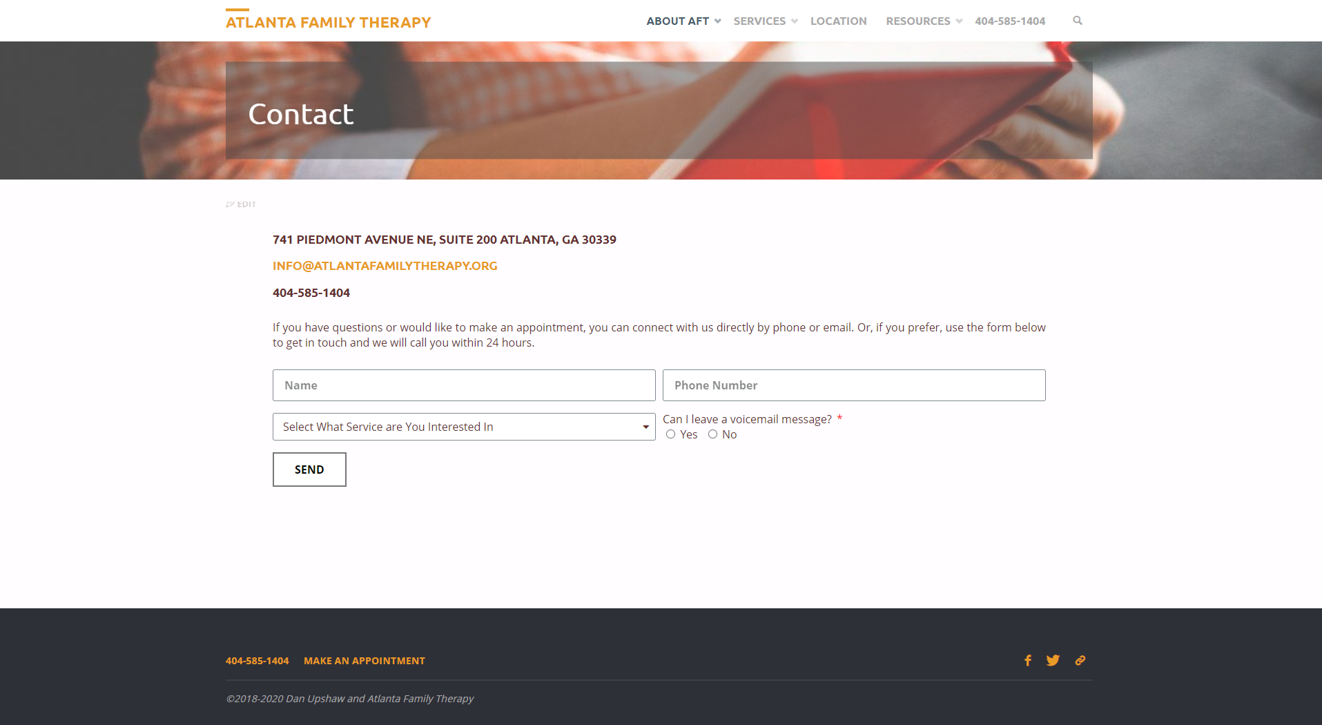
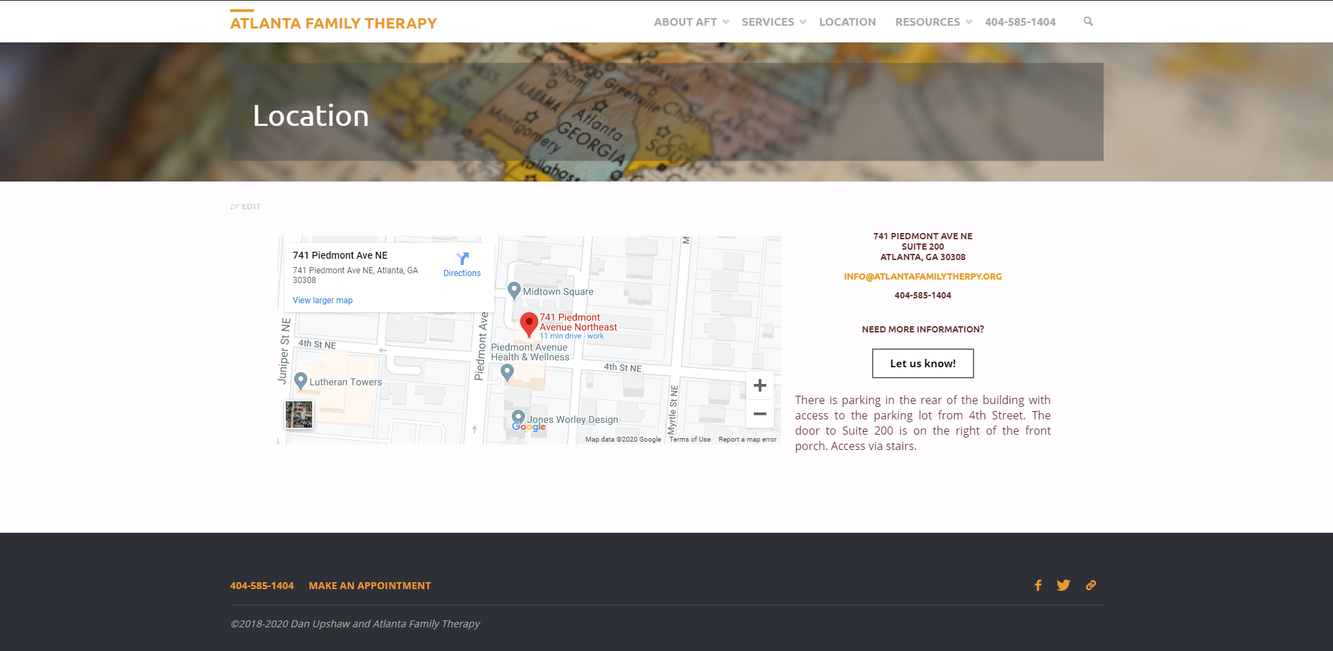
Key pages were redesigned to support high‑intent actions:
The primary constraint was the existing WordPress platform, which I was not deeply familiar with at the time. I ramped quickly, learned the system, and implemented the final experience directly—ensuring the IA and content structure were maintainable and easy for the client to update after handoff.
Following launch, Dan reported an increase in prospective client inquiries and noted that clients arrived with a clearer understanding of his services and practice. While no formal analytics were in place, the redesigned information architecture targeted the highest‑impact levers for this type of service experience:
In practice, the site better supported self‑qualification, increasing the likelihood that inquiries were both higher‑intent and better aligned with the services offered.
Looking back on this project now, with several years of product design experience, I see it as an early example of how information architecture directly drives conversion—especially in trust‑heavy domains like healthcare, where uncertainty is the primary barrier.
At the time, I approached the work as reorganizing pages. Today, I would describe it as designing a decision system: mapping user decision stages to content structure, using navigation as a prioritization mechanism, and deliberately reducing uncertainty at each step. That shift—from “site redesign” to “decision support”—has become foundational to how I approach product problems now.
This project reinforced a lesson I still apply: strong UX often comes from making the right information easier to find, rather than adding more features.


